

We are proud to introduce a new visual identity that brings together our diverse spaces and activities under one strong brand. The visual identity was created by Prague-based MiniMax Studio.
New visual identity
The rebranding reflects the evolution of our company, which has gradually transformed from a traditional glassworks into a multifaceted cultural and experiential destination connecting glassmaking, art, design, and gastronomy.
Today, our site includes a glass studio, restaurant, museum, and gallery shop. This unique combination of activities led to the decision to create a unified visual identity capable of communicating the entire concept in a clear and cohesive way.
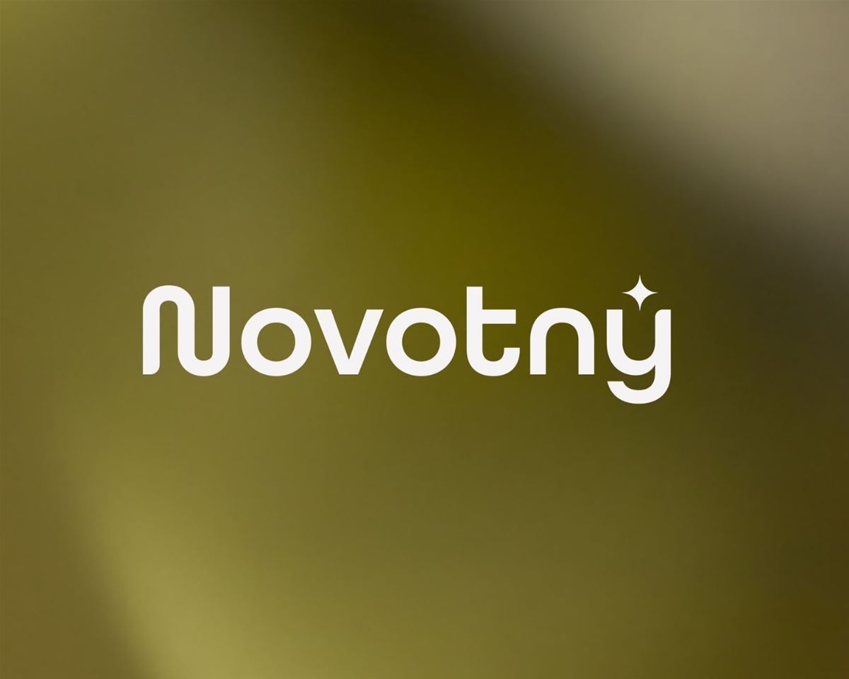
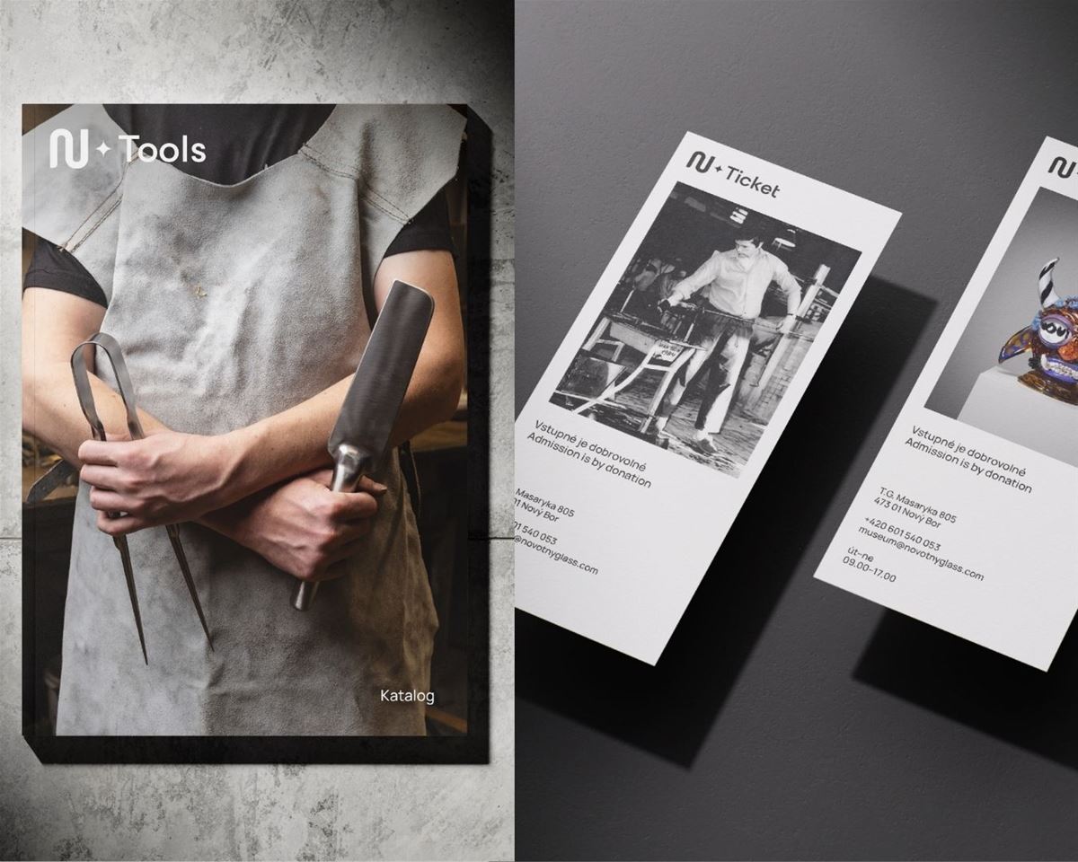
The visual system is built around three core elements: the Novotný logotype, the “N” initial with a star, and the star symbol itself. For the studio, the “N” is more than an initial. “We see it as a symbol of movement and an open, dynamic element that connects the different parts of the brand. The ‘N’ acts as a frame at the beginning of communication, while the star naturally brings it to a close. Between these two points, a space is created in which the entire story of the brand can unfold,” explains graphic designer Matěj Brnický.
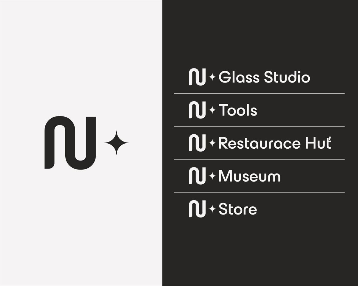
The star symbol operates on several levels at once. It evokes the sparkle and brilliance of glass, while also functioning as a “plus” sign that allows the brand to expand across different parts of the site. In international contexts, it effectively replaces the diacritic in the Novotný name. At the same time, it completes the identity like a hallmark, symbolising quality and origin.
The star is also far from arbitrary in form. It is based on the same principle that runs throughout the typography - a subtle sense of refinement, where the beginnings and ends of letter strokes are gently rounded. This deliberate and understated detail references the process of shaping and working with material.
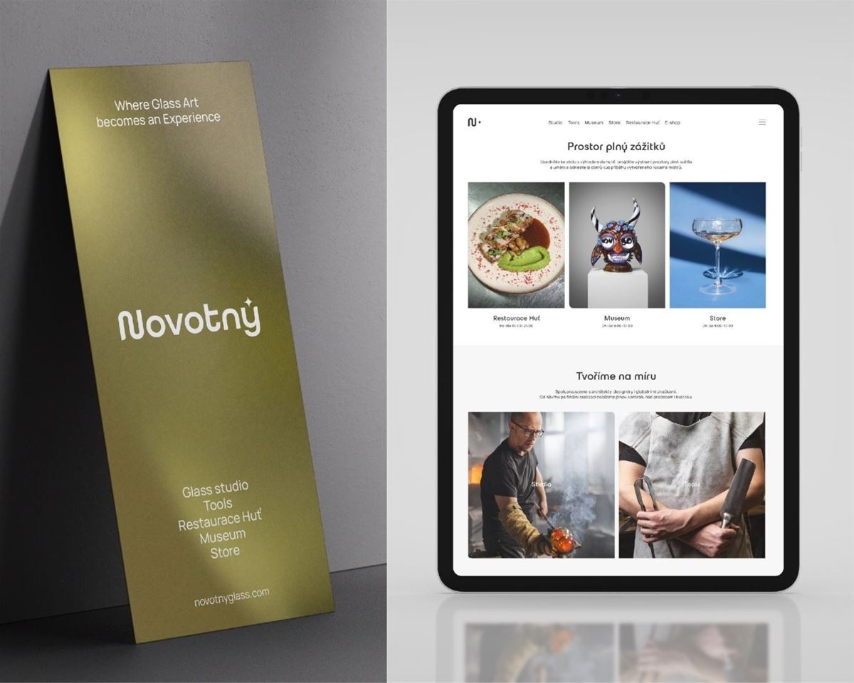
The visual system therefore embraces a principle of openness and flexibility, allowing it to encompass this wide range of activities without losing its clear and recognisable structure.
“Because the brand brings together many different aspects, it was important for us to create an identity that would not focus on just one of them. We designed a visual system flexible enough to represent craft, art, and experiences, while naturally connecting them into one coherent whole,” explain the creators.
At the heart of the project lies a shared belief embraced by the creative studio MiniMax Studio — that building on the work of previous generations, developing it within a contemporary context, and caring for a family legacy are not sentimental gestures, but part of everyday work.
“We see the uniqueness of this story in the Novotný brothers, who successfully took over the family glass center and continue to actively develop it. Rather than simply managing an inherited legacy or choosing an easier path, they are building on it, moving it forward, and giving it a contemporary form. That is far from ordinary and gives the brand a distinct energy and authenticity,” says Johan Vlach.
The creator of the visual identity is MiniMax Studio, whose owner, Johan Vlach, brings nearly thirty years of experience, working primarily with clients in the cultural sector. His work includes visual identities for Prague Sounds (formerly Strings of Autumn), the Czech Philharmonic, Prague Symphony Orchestra FOK, Prague Chamber Philharmonia, and the Prague Spring Festival, as well as companies such as Preciosa and family-owned businesses like CS-BETON.